VistaPrint


Project
Configuration flow
Industry
DTC E-Comm: Web-to-Print
Role
UX/UI Design Direction, Responsive Design, Prototyping, User Testing
Agency
TheLabNYC
Challenges
Drop-off rate was high. User research revealed overall friction, lack of clarity, and poor information hierarchy. A cohesive flow was difficult due to multiple product owners and tech constraints.
Too many decisions upfront
Not seeing design templates soon enough
Buried product info
Unclear price transparency
No clear flow or progression
Before & After
To help guide small business owners towards checkout, I broke down steps, made key information easy to find and digest, and introduced a persistent path to purchase—resulting in a more intuitive, streamlined path to purchase.


Core Improvements
Insights from user testing found that small business owners wanted:
Design options sooner.
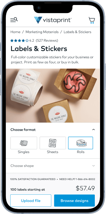
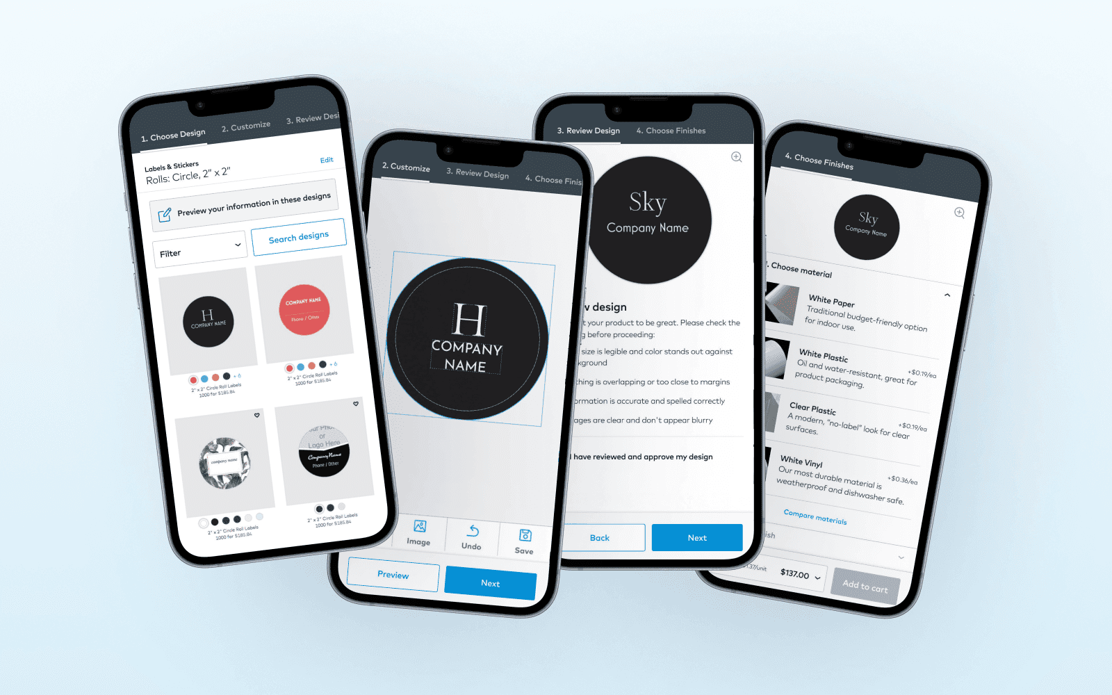
Seeing designs first was not possible due to technical constraints. I broke up configuration choices, starting with just two, so that designs could be surfaced sooner. As a result, product information was able to gain more visibility above the fold.

Site visitors make two choices before seeing designs

Supporting information.
Easy to find in key decision moments
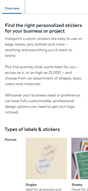
Product Information
From product details to comparing options, information is organized in tabs for users to quickly navigate to information they need.


Cost transparency
To make it easier for decision makers to understand the bottom line, cost per unit and configuration costs were incorporated, speeding up the potential to "Add to cart".
Guidance and assurance.
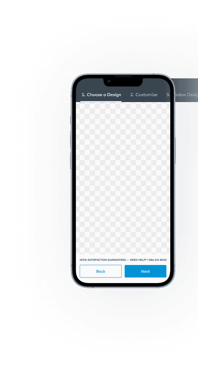
Introducing persistent next steps and progress
The experience was disjointed and inconsistent. With limited scope, I collaborated across teams to introduce a low-effort solution that unified the flow and guided users toward checkout:
Anchored CTAs and progress indicator
Established consistent interaction patterns
Created a more cohesive end-to-end experience
Takeaways
This was an unusual new client-agency partnership with much ambiguity. I actively drove progress by continuously asking questions, steering design and process, and fostering collaboration.
My key contributions: