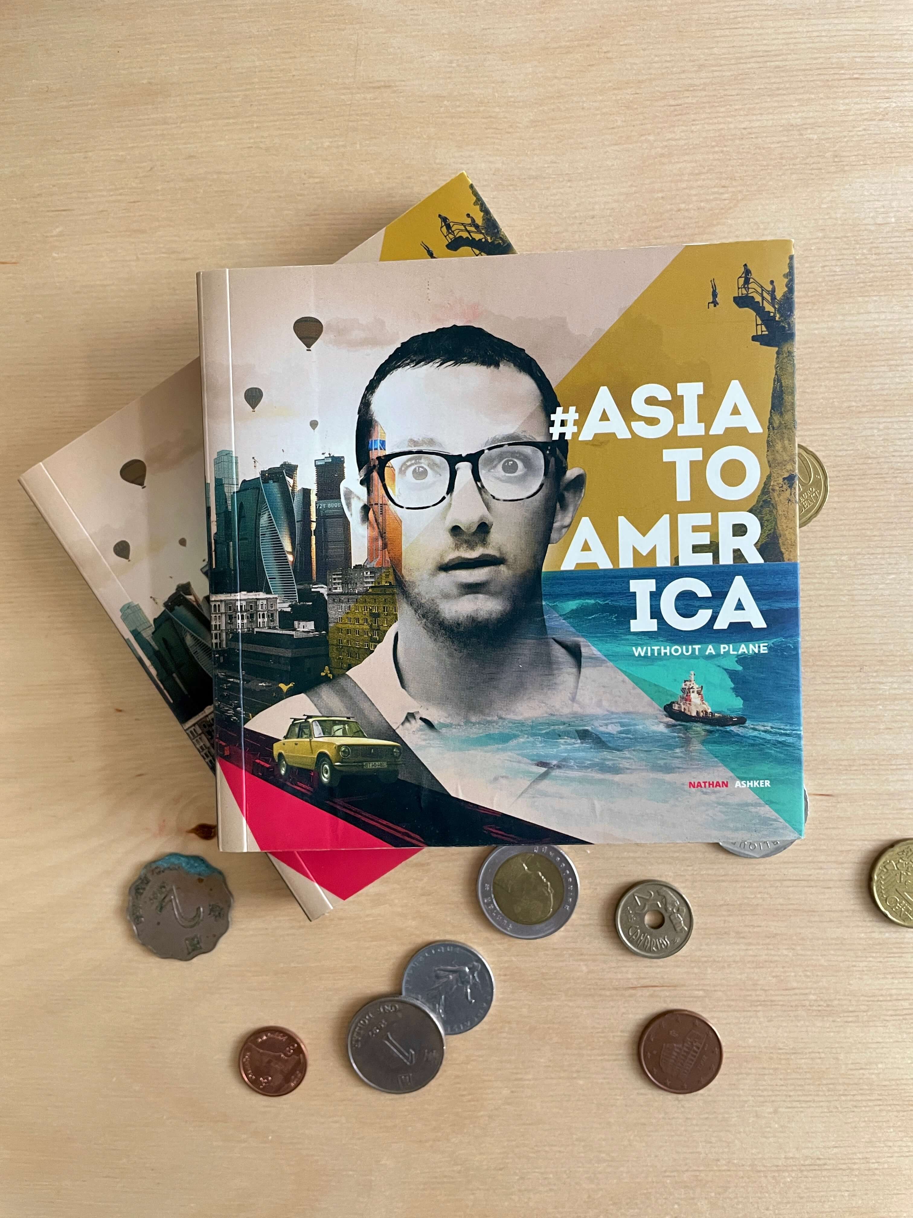
Project
Book Design
Industry
Travel
Memoir
Services
Creative Direction

#Project Goals

Design
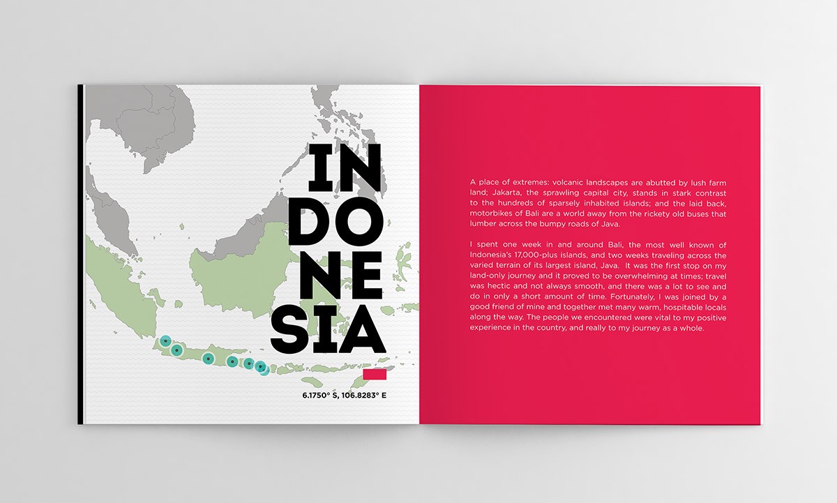
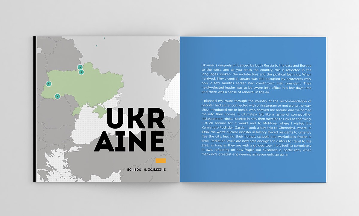
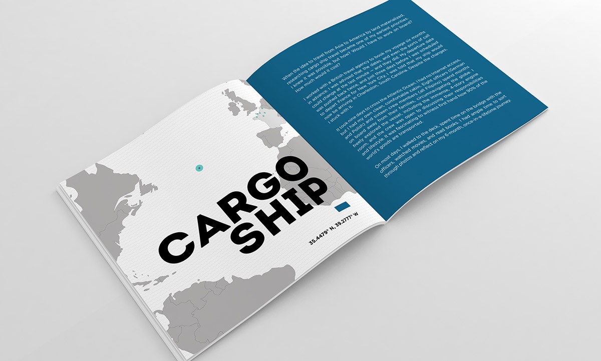
I approached design with a strong typeface to reflect Nathan's bold adventure. To create visual distinction for each county, I created a system using two primary colors from the nation's flag and their geographical coordinates. The colors were used both in country introduction pages and photo pages. The maps included points to indicate where Nathan had visited.
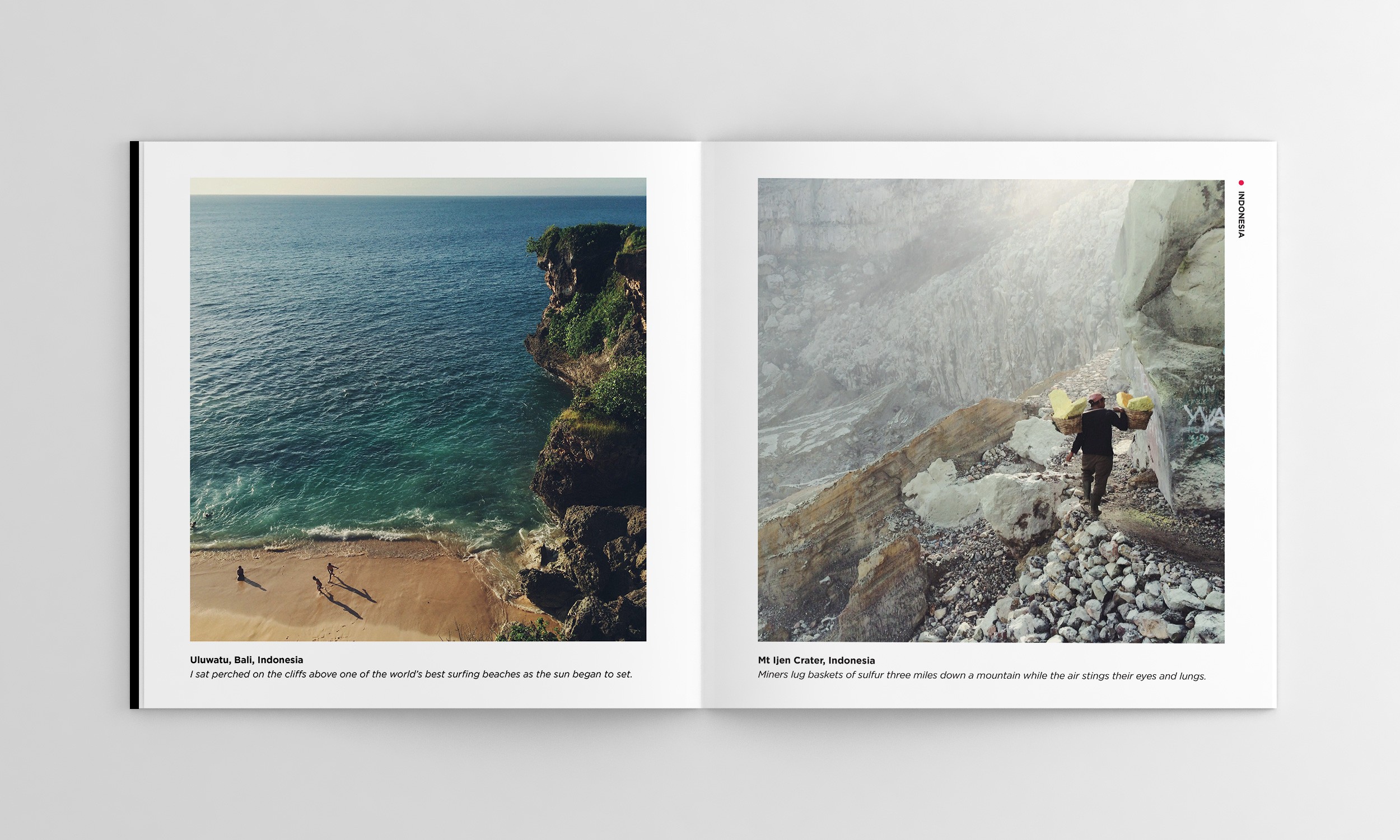
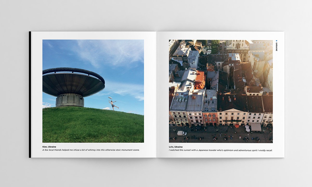
Layouts were a mix of short essays, anecdotes, photographs, and quotes.